Case Study: Premium Herbal Lion Label Design
Premium Label Design Case Study
When Sodiko, a prominent division of the esteemed Belgian La Martiniquaise group, approached us to conceptualise the Herbal Lion project, they laid down a formidable gauntlet: launching an unprecedented herbal liqueur directly into a market ruthlessly dominated by Jägermeister.
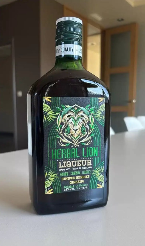
They arrived bearing a strategically formulated brand identity—anchored by a commanding symbol (the lion) and an unequivocally premium colour palette defined by deep greens, resplendent golds, and sophisticated dark tones.
Our critical mission was to architect a meticulously crafted liqueur label design capable of flawlessly translating this overarching brand vision into incontestable shelf impact, thereby forging instantaneous visual differentiation and an exceptionally memorable image.
Read also:
The creative process invariably commences with rigorous strategic analysis. On this occasion, we isolated three quintessential success factors to dictate our design trajectory:
We channelled our focus precisely toward maximising the logo's impact—the quintessential lion symbol—through highly strategic placement and refined visual treatment. The lion naturally evolved into the beating heart of the packaging design—a potent focal point emanating raw power, ingeniously conceived to violently catch ambient light via its golden foil finish and generate compelling visual motion to ruthlessly seize attention at the point of sale.

The Herbal Lion label – an unequivocally premium packaging design heavily inspired by the raw power of the lion and the organic purity of botanicals, meticulously created for a Belgian liqueur infused with rhubarb, ginseng, and juniper.
The visual architecture intrinsic to the label operates simultaneously on multiple strategic tiers.
We rigorously maintained absolute transparency regarding the ingredients, with rhubarb, cinnamon, liquorice, juniper, and ginseng listed with pristine clarity—a facet profoundly deeply appreciated by modern consumers who vehemently prize authenticity.
Crucial technical details (such as the 35% alcohol volume) demanded by current regulations were incorporated with high visibility yet remained wonderfully discreet, entirely avoiding any disruption to the seamless design flow.
The Herbal Lion label conspicuously incorporates lustrous golden metallic accents alongside incredibly fine embossing, purposefully engineering the unmistakably premium aesthetic that flawlessly resonates with discerning purchasers of luxury spirits. Admittedly, these premium finishes can easily double the label's production costs, noticeably elevating the final packaging expenditure; however, they constitute an absolutely essential investment when your primary competitive weapons are unsurpassed quality and absolute excellence.
Within the fiercely competitive amphitheatre of premium alcoholic beverages, sheer packaging perfection dictates the razor-thin margin between sweeping success and dismal failure. Absolutely everything matters: the precisely calibrated colours that mercilessly draw the eye from 3 metres away, the tactile details that delight you the moment you grasp the bottle, the luxurious texture that silently screams quality upon touch.
Every solitary element works tirelessly to instantly transform a fleeting first impression into a resolute purchasing decision. Your forthcoming product launch unequivocally deserves an exterior that wholly dominates the shelf. Contact us today to discuss precisely how you can radically maximise your packaging's impact through uncompromising, high-calibre design.